Talk
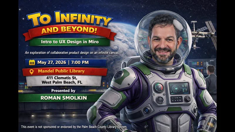
Intro to UX Design in Miro – To Infinity and Beyond
My first Miro Meetup as an ambassador.
Transcript
Well, thank you, folks, for joining me today for my first presentation as the official Miro Ambassador for South Florida. I’m excited to be here to share some of the reasons why I absolutely love using Miro every day for UX, some UI design, and other things as well. The main reason I called this talk “To Infinity and Beyond” is because Miro is known for having an infinite canvas. So the talk is going to be a brief introduction to UX design, but in Miro. Unlike the old-fashioned conference rooms, similar to this one, you don’t have to worry about having a wall, or the end of a canvas, or the end of a whiteboard.
A little bit about me. My name is Roman Smolkin. I lead a product design team for UX and UI work, and I’ve been doing that for about eight years now. Before that, I spent 14 years as a developer. I’m also a classically trained violinist, and more recently I’ve spent 12 years as a professional photographer, with some award-winning photos, including Photo of the Year last year. And I got the championship trophy at the pickleball club championship this year as well. So if anybody is up for a tennis or pickleball game, or wants some good photos, let me know. My contact information is listed on here.
If you would also like to see the slides, you can get them at the bit.ly link for Miro West Palm Beach. This slide deck, actually this whole file, will be available to you in view-only mode, so you don’t need to take pictures of the screen, and you can just follow along.
So the biggest reason we’re here today, I think, is to get out of the Stone Age. This is not really new anymore, but it is still true, and the biggest change came with COVID. Before COVID, we would very often still be stuck in conference rooms with limited space, no matter how large they were, sticking big poster sheets on walls and sticky notes on those, then trying to find where that sticky was, or trying to read everybody’s handwriting, and not really being able to go beyond stickies. And then the next day somebody else would come in and, accidentally or on purpose, erase the entire whiteboard, because now they needed to have a different meeting in that room. Somebody may or may not have taken a picture of what you had on the board with their phone. So you might have lost an entire day, or multiple days, of work and ideas, and it was really, really hard to recollect it.
Having remote members in the room was basically impossible. For somebody to see what happened in the room afterwards was also impossible. And there was basically no undo. If you had spelling errors, or put things in the wrong place, I guess you could write more stickies, but you couldn’t just erase. Well, on a whiteboard you can do a little bit of erasing, but it was mostly handwritten, mostly messy, and not really easy to do what you can do today in Miro.
And you can go so much beyond sticky notes and so much beyond writing: putting entire documents on there that are editable, putting entire interactive prototypes on your boards. You can vote on them with your teams. It’s created so much freedom in how we can operate with a remote team, very successfully, day in and day out.
So why Miro specifically for UX? It does have many other uses, and I’ve even used it for personal stuff as well. But the biggest thing, which I already mentioned, is of course the infinite canvas. There are no edges. There are no limits. You can zoom out to see as much as you want, or zoom in to see something as close as you need. So it gives you complete flexibility. I would still recommend using the biggest monitor you can with it, so that you still get the feel of a large whiteboard. In fact, I’ve been a Miro user since before it was called Miro. It was originally called RealtimeBoard, because that’s what it was: it allowed you to put stickies on a virtual whiteboard. And it has really evolved over the years.
It’s probably worth saying that Miro does have competition. They’re certainly not the only product that can do something like this, and perhaps their biggest recent competition has come from Figma. For a long time Figma wasn’t really a threat to Miro, because it was primarily focused on design. It does also have an infinite canvas, but it didn’t have all the tools Miro did, like stickies and all the templates, which were geared more toward UX as opposed to UI design. In the last few years, multiple new products have come out from Figma. One is called FigJam, which is essentially a Miro clone, and as good as it is, it’s now included in the Figma subscription. So if you are paying for Figma, it might be the right choice, and it does have some really cool tools. But it’s still light years behind Miro (no pun intended; actually, pun fully intended). They’re doing really well for what they are, and they’re accelerating really quickly, but you can just do a lot more in Miro. It’s more polished, and it’s got more connected applications available to you inside Miro.
On the flip side, Figma also has a different product called Slides, which lets you create slide decks similar to this one. By the way, this one was created in Miro, and I can show you exactly how I did it. The coolest thing about Figma Slides is that you can include interactive Figma prototypes right inside your slides, which for a while was the winning feature of Figma Slides against Miro. But that is also no longer true, because now you can plug interactive Claude prototypes right into a Miro board and put those on your slides. So that is really going to blow things out of the water. You can have live websites embedded right inside Miro if you want, that work, and you can interact with them.
Real-time collaboration, of course, is another huge feature. Since COVID we’re so used to being geographically diverse teams. I have folks in my company from Ukraine, Spain, all over the United States, and other countries, and many people I know also have co-workers all around the globe. So real-time collaboration through Miro and similar tools has really transformed what’s possible for us to do. We no longer have to be locked in the same room to be productive as a team.
And it does give you complete flexibility. Yes, you have your sticky notes and your wireframes, but Miro allows you to organize any kind of data you need. You can throw PDF documents in there. You can put YouTube videos in there and make shorter clips out of them, and have the pieces you want to show all in Miro. It is tremendously powerful, and most people probably use less than 1% of what it can do for them.
Today is supposed to be about UX, not just Miro. I’m going to spend very little time on UX today, but I will give you the highlights, and if you ask questions I can dive deeper into other topics. Otherwise, I think we’ll save more UX for next time. I’m a huge proponent of the design thinking process. It originated with the Stanford School of Design, and it’s probably the de facto standard across UX teams. There are others: IBM has come up with one, there’s one called the Double Diamond, and a few others. But design thinking stands out because, A, it’s simple, and B, it really makes sense and it does work. It breaks things down into five pretty straightforward phases. The most important part is that you can go from any phase to any other phase. So it’s a loop, essentially an infinite loop, and there’s an unmentioned sixth phase as well: implementation.
You start by empathizing with your users. You try to get a deeper understanding of what affects their day-to-day life and what would make their life better. What can we do as product developers and designers to create something that really opens up flexibility for them and, ideally, saves them time? My personal biggest claim to fame is that I can find and save a click in any piece of software. Give me any piece of software and I will find at least one click that could be eliminated, and reduce the time people need to do something. Usually I can save dozens, if not hundreds.
So you empathize with the users. Once you have a good understanding of what’s getting in their way, what’s creating friction in their workday, and what a feature could help them with, then you define the actual problem. You go through the findings, and defining the right problem is very important, because if you don’t create the correct problem statement, you might create a great solution to a problem that nobody has. Actually understanding what people need and fulfilling that need is completely essential, as opposed to creating a great feature that nobody really asked for. That is such a key distinction. Defining the problem statement sounds trivial, like writing down one or two sentences, but it’s not. You really have to analyze everything you learned in the first phase to define the proper problem statement, so your team can focus on solving the right problems.
The next two are my personal favorites. The first two are often referred to as UX research, and the next two are often referred to as UX design. UI also comes into play in the next two phases. I don’t do as much research myself. I work with a team, and in my company most of the research is actually done by product owners rather than UX researchers, but sometimes you have business analysts who do the research as well. So it really varies; it’s kind of a field within the field.
Then you begin your ideation, and the coolest thing about ideation is that there’s no such thing as a bad idea. No ideas are thrown out. Every idea is documented and placed on a whiteboard, and every idea can be examined. At the very least you want to document it. After you’ve analyzed all your ideas and picked the one you’re actually going to move forward with, sometimes years later people will come to you and say, “Hey, I have a better idea, we should do this,” and you can go back to your ideation documentation, usually in Miro, sometimes in Figma, sometimes on paper. I’ve done this multiple times: we looked at that idea, we evaluated it thoroughly, we did user testing on it, and we proved that particular idea doesn’t work. So you put all the ideas you can on this infinite whiteboard and pick which ones you’re going to move forward with, but you also document which ones you’re not going to move forward with, and why. That’s a big part of the whole process.
Then you begin prototyping. Prototyping can be low fidelity, which can be done fairly easily in Miro, or mid-fidelity or high fidelity, which is probably better done in Figma, or nowadays in AI tools as well. Miro does charge extra for their UI prototyping kit, which essentially doubles your subscription, but it is kind of worth it, unless you already subscribe to something like Claude Design, and then it’s really not worth it in my opinion, because that can do better. But it’s there for you, and Miro also has AI, which is fairly robust as well.
And of course, after you have your prototypes, essentially after every phase of prototyping, whether it’s low, mid, or high fidelity, you have to test with real users. You have to get real feedback. You have to analyze whether your solution is actually working. Maybe parts of it are working and parts of it can be improved. You really have to go back and iterate through the process a few more times: go back to your users, test with your users, refine your problem statements, perhaps do some more ideation, refine your prototypes, and test again. When you’re satisfied with your testing, that’s when you progress to implementation.
The reason implementation isn’t really part of the Stanford School of Design process is that this process, among many other things, is designed to save companies a lot of money. If you go to code (unless AI is doing it for you nowadays, but then you’re just spending money on AI), that is theoretically a much slower process than getting a simple prototype built in something like Figma. You can go from minutes of work to testing something with users, versus maybe days, months, or years of work, depending on what you’re actually building. So it is essential to test the prototype before you release it in code. And of course testing in code is just as essential, maybe even more, but that’s a different conversation and doesn’t involve the design thinking process.
Audience: The projects that you take on, you take them through this framework basically every single time?
Good question. The question was: the projects that I take on, do I take them through this framework every single time? The basic answer is yes. The question is, do I actually do every single step myself? Usually the answer to that is no. I work with a team where, 90% of the time, the empathize and define steps are done for me by my team. Not always. Sometimes I’ve actually gone on site with clients and sat next to them. So I have done it, and I do it sometimes. But usually it’s other members of my team who regularly travel on site. They record sessions with the users and interview them. Some of it also comes from outside our team, from the sales and marketing teams, a lot from their pitches.
The ideation, yes, absolutely. It can now also start with the help of AI, and of course my team, but I love the ideation phase and I love the prototyping phase, so that’s where I spend the bulk of my days. And testing: usually the product owners take ownership of that step, because they have to get clients on a call and get them scheduled. Sometimes we test directly, but usually it’s through a remote presentation, where somebody leads the testing session and we gather feedback that way.
Audience: How many of these steps, like the testing step, can be done by AI, if it has the proper requirements for this whole process and what the customer is looking for? Like in code, right? You can have an agent that’s writing the code and an agent that’s reviewing the code, and those could be two different providers.
Testing is probably the least likely for AI here, because that’s why you want real user feedback. The earlier phases, when you’re gathering information and analyzing it, are absolutely a great opportunity for AI. When you’re putting all those stickies up on a board to cluster them, Miro actually has a clustering feature. It’s really cool: you can cluster by color, you can cluster by topic, you can get their AI to start moving things around for you. There are other really good tools for that as well. In ideation and prototyping, you can make one prototype, throw it at AI, and say, “Give me three more things similar to it,” or not similar to it, “go crazy.” Or you can have it make the first version for you, which is very common now, and it does pretty darn well for what I call the first wireframe. Even when they look like built websites and they’re interactive, they’re still serving the purpose of your initial wireframe. They’re meant to be thrown out, not meant to be full-featured. So you do what you can, and then you evaluate, and then you get to your users. You still have to test. We actually show Claude Design prototypes to our users to get feedback, sometimes before going through the actual prototyping process. And we’ve polished our Claude Design setup to the point where it looks like our product.
Some key features in Miro. We’ve already mentioned some of them, but not all. Sticky notes have been around in Miro a long time, and I’ve been using it just about as long. Sticky notes are the astronaut’s best friend: you can capture your ideas, get feedback, color-code things, and cluster them across your board. We just talked about that.
Frames let you group things, in a million different ways, and you can have frames inside frames if you want. There are an infinite number of uses for frames. You can use them as your slides, and they don’t even have to be the same size. Miro is smart enough to zoom in to a frame and do the best it can to fit it on the screen. It also lets you zoom in around your frame while in a presentation. So it’s very possible, maybe not ideal. I like to keep my frames fairly uniform. I like the HD dimensions, so they size better for a presentation, but not always. Sometimes you just want to throw a bunch of sticky notes on there.
So, frames. You can use frames for organizing things, for timing, like the phases of product rollouts, for grouping things that are related, for analyzing things by category. There’s a huge number of ways you can use frames. I did mention that Miro has a built-in UI component library and shape library you can use to build little prototypes. They charge extra for it, but you can do a more basic version with just shapes, which is often sufficient, especially if you’re going to get AI involved shortly after. But if you are willing to pay (I think it’s $8 a month per user), it’s great, because it helps you throw things together very quickly, and it doesn’t have the same limitation as Figma, where you have to be more precise and think in a much more structured way. In Miro you can be much looser and much more imperfect and still get things done. And perhaps one of its biggest selling points is the huge number of templates available to start with. I’ll show you a couple of examples of those.
Some activities for the crew on your spaceship to collaborate on. Of course, user research synthesis: you combine everything you learned in the empathize step of the design thinking process and begin synthesizing it, creating journey maps for your users, flow diagrams, the beginnings of your data architecture, and a visualization of the emotions, pain points, and opportunities across the entire journey.
And my favorite is critiques. It used to be that we just threw screenshots in here and compared them. It’s a very quick way to compare. You can vote right on them with stickies or with emojis. There are all sorts of things you can do. You can make votes anonymous if you want, so you can count them anonymously and then show people who voted for what, or just how many voted for what. It’s a really great way to have your team vote without affecting other people’s votes. And now, like I said, you can do it with interactive work too. You can embed entire web pages in Miro, and interactive prototypes, so those become really useful. And of course you can still paste screenshots in. I love doing design critiques in Miro because it feels interactive. You see everybody’s cursors moving around. People can comment on your work. They can put stickies right on top of it. They can draw around it. They can really point things out, and that stuff doesn’t disappear. You put the work on there, and when you’re done it’s all there for your records.
Then you begin your launch sequence. You start creating the rough sketches we talked about, going from ideas to prototypes. You can use low-fidelity prototypes from Miro or from other tools, and usually you’ll bring high-fidelity designs from other tools back into Miro for your critiques. All three can coexist on one board in the same space, maybe even in the same frame if you want to show the progression. It makes it very easy to show your work, even if Miro isn’t where you do all of it.
Some best practices for Miro. Use frames as your star maps. They help you navigate within your board, and I’ll show you in the demo: there’s a map inside Miro to help you navigate around a big file. Color-code your galaxy. On my team we have a pretty standard use of colors. Yellow stickies are just your normal informational stuff. Orange means we have a question about something. Red means we’ve decided against something, or it’s a feature we’re scrapping. Blue means it’s an action that needs to be taken. And usually we have a color dedicated to some key team members, so somebody might get black, somebody might get teal, so they know those are their action items. So we have multiple colors for action items, depending on who needs to do what. Then you can quickly sort your board by color and see: what are all the questions? What did we scrap? What do we need to discuss? What are the action items, and who’s going to do what? I’m a big fan of doing it that way. You don’t have to pick those colors; pick your own poison. But the point is to color-code within your files.
Zoom levels. I’ll also show you my favorite way of navigating within Miro. Zoom levels help you get really close to something if you need to look at detail, or zoom out to get a much bigger, high-level picture. And one thing most people probably won’t tell you is that you do have to tidy up your Miro files. They can get huge. They can get messy. They can get a little slow. So take your time. If you had the meeting in a conference room, you’d have to clean up a little afterwards. You want to get your ideas organized, archive things that need to be archived, save things that need to be saved, and group them a little better. It’s important to regularly go back and tidy up your spaceship.
Audience: Who participates in all these meetings normally?
Who participates in all these meetings? That’s a really good question, and it varies with the meeting. It can be as small as me and my UI team. It could be me and a product owner, or multiple product owners. We’ll often have stakeholders join, and we’ll often have clients join, though for client meetings we haven’t actually gotten them into Miro yet. We’re sticking to slide decks in PowerPoint. Figma Slides has also gotten really good. But we’re still using PowerPoint for client presentations, or we take them into interactive Figma prototypes, and now Claude Design prototypes. So we do a lot of interactive prototypes, whether in Claude Design or fully polished in Figma, and then a lot of good old-fashioned slideshows, which are becoming really old-fashioned, so we’re trying to move away from that.
Audience: But what’s the point in keeping Figma? We have Figma with a couple of design seats, and some FigJam licenses. With Claude Design, can I just import everything into Claude Design and get rid of my Figma subscription?
Can you get rid of your Figma subscription? I think in 2026 the answer is no; we’re not there yet. In 2027 the answer is maybe. I was able to get Claude Design very close to our current design system. Very close. It still makes way too many mistakes. Most of the mistakes are acceptable, but it is not pixel-perfect. And if you want pixel-perfect, and in the design world you usually do, you still need Figma. Also, Figma is about to release their agents, and I’m signing up for their beta program. I saw the demos, and they blew my mind with what’s possible in Figma. It’s basically going to be like Claude Design on steroids.
I haven’t shown you Miro AI yet. The coolest thing about Miro AI is its ability to get context from your board. Instead of having to type up a bunch of information or upload things, you can highlight as much or as little of your board as you want, and it will use that as context for your prompt. So the prompt can be very short and the context can be as big as you need, based on whatever you select. Figma is doing something very similar: it’s aware of your design system and all your other design parts, so you can give it context by giving it your frames, your Figma files, other related Figma files, maybe your prototype. So in my mind it can do so much more than Claude Design can today. Tomorrow might be a different story. All I know for sure is that they’re going to push each other really fast and really hard. We’re at the beginning; this is the tip of the iceberg. But until then, the tools are phenomenal.
Figma is also a tool I use every day. I do use Figma more than I use Miro, but I almost never use FigJam, because we have Miro. We pay for both. We don’t have to, but it’s actually cheaper for non-designers to have Miro, because a Miro seat is $8 and a full Figma seat is $15, which includes FigJam and Slides. So it depends on what your teams are like. For people doing design, Figma makes perfect sense. For developers who are integrating it with Claude Code, it makes perfect sense to have a design seat, because now they can connect to the MCP server and be in context. Again, it connects the pieces much better than Claude alone. Claude Design is a great way to create a first-draft prototype that looks better than an old-fashioned wireframe.
Audience: This question is probably going to make me sound like exactly what I am, which is someone who doesn’t know much about that part of the design process, because I run hyper-agile teams. Typically our prototyping is next to zero; we usually start with the product. So my question would be: how do you get the information in and out of the prototyping tool so that it’s useful for the development side?
Great question, and I guess it depends on what information you’re trying to get. First of all, I would say hyper-agile is great, but you’re still blowing a ton of money on development that could be saved by doing at least one iteration of design.
Audience: I agree with you 100%.
Right. Prototyping is invaluable because of how fast you can get something to look like real software without having to do a single thing to make it real software, and then you can get real feedback and know whether you’re on the right track or not. You can also connect the different tools and eventually get to code with the assistance of AI, so you can get much better coded prototypes faster, too.
Audience: So I have my, let’s call it, high-def prototype. Can I export that in the form of assets, essentially?
Again, it depends on what you need. From Figma, we started not long ago with Claude Code, where with an MCP server it can connect to actual Figma frames, leveraging our design system and all its variants. I’ll give you a very simple example: a button. A button has a default state, a hover state, a pressed state, a focused or tabbed state, usually a disabled state, maybe an error state, so give or take six states, maybe an animation state for when it’s loading. We took every state of a whole bunch of different buttons: primary, secondary, tertiary, link button, circle button, call-to-action button, you name it. We have a very robust design system and component library. We gave all of that to Claude Code, and it was able to introspect every little piece almost effortlessly and produce Storybook. If you’re not using Storybook, it’s another fantastic product, and you should be using it. We just started using it recently, and it really is phenomenal. Claude Code can produce actual Storybook components that you can then use directly in code. Now our developers are spending way less time on front-end coding and way more time on back-end coding, because Claude is able to assist them so much with the front end.
Audience: But before AI could take those things and code them into front-end assets, what was the workflow there?
There could be multiple; it really depends on the developer’s preference. The perfect workflow for us could be the Figma developer seat, where they can introspect all the states. You can have annotations, and you can measure things precisely. That’s really outside today’s talk, but within Figma you can see CSS code and all the stuff that would help the developer.
Audience: You could almost get stylesheets, potentially?
Yes, basically.
Audience: Like TS files, or even HTML files, right?
The downside before was that it wouldn’t tie them into something like SCSS, so you wouldn’t have variables; you’d just have kind of messy CSS. But now with Claude Code that’s no longer a limitation. It’s able to take all of that, reference all your variables and colors, and cross-reference all the stuff you would have had to do manually, and it just does it. So the handoff process could be through Figma’s Dev Mode. But, and I keep saying old-fashioned, screenshots were sufficient for a long time. There’s a lot you can do with a very basic screenshot, and even more with a basic animated prototype. Up until last year, all our prototypes were in Figma, and they had interactive states: when you hover on a button you see it, when you click on it you see what happens, and we had transitions in our prototypes. So it really gave our users a feel for what it was going to be before it was built.
But it’s not just users. When you’re testing, you should also be involving the developers. I should almost go back to the earlier slide, because this is a very important thing: this process is not just about your design team, not just about your product team, and not just about your users. It is also about the people who are going to be building it, which is your developers. They should be involved as much as possible during the entire process: especially ideation, where they should be weighing in; prototyping, where they should be giving feedback on what is and isn’t feasible; and testing, where they should be one of the testers of the design, to see not only whether it’s going to solve a problem for somebody, but whether it’s going to work for them to write code around it. Does it make sense? Would they need us to tweak something? Maybe something can be done in code, but it would take a year versus a month versus a day. For better or worse, we have had to modify way too many designs based on the scope of work they would require from a developer. So sometimes you scale back a certain choice and say, “Hey, this gets us 90% there, but it only takes 10% of the development time. Okay, we’re doing it.” Sometimes you have to adjust, and bringing your development team into your ideation, prototyping, and testing phases is essential. They also have great ideas.
Especially today with AI, an experienced developer can jump in and create a prototype. So the question becomes more: do you actually need a designer? And the answer to that, in my opinion, is absolutely still yes, because we think of things that developers don’t. They think about different problems, and they do different things for a living; I know, having been a developer for 14 years. When I look at what Claude Design is producing right now, at first glance it looks really impressive. Like, really impressive. But if you take even five minutes for a deeper dive into the result, the number of what I’d call UI mistakes it makes is ridiculous. So today it’s just good enough to be the first draft: to help you iterate through your process, to present something, and then to hand to your designers so they can do it properly in Figma. That’s how I would go about it.
So your mission starts now. If you haven’t tried Miro yet, today is the day. They actually have a secret feature where anybody can use Miro for free for a day: there’s miro.com/lite, and the next day the board just disappears. So if you ever just need to use Miro in a meeting without a subscription, you can use it for a day, and then it disappears. There are pros and cons to that; if you can afford it, just buy it. Create your first board, invite your co-workers, invite your crew, and blast your project off. But this is not the end. This is just the beginning, because after you blast off, you have to start steering the ship. And this is where I wanted to show you some tips and tricks for how I actually use Miro.
Except I have one more slide, and I forgot what it is. Oh, how to use templates. I’ll talk through both of these and then actually show you. I’ll show you some examples of templates, how I use them, and which ones you can use. There are so many that I won’t show you all of them. You can use them for user research and synthesis, journey mapping, and persona building. I really like them for persona building; they streamline the process a lot. You can use them for prototyping and wireframing, and definitely for design critiques and feedback, and many, many other things. I’m actually going to change my glasses so I can see a little better.
So let’s talk about how to actually use Miro if you haven’t used it before. My first and favorite tip for every new Miro user (and I’m sorry to say it, Miro) is that they have two different modes of navigation: a mouse mode and a trackpad mode. I don’t know why they have a mouse mode. I can’t use it. The first thing I always do is switch to trackpad mode, and I still use it with a mouse, even though I use a trackball. Trackpad mode works the same as Figma. Mouse mode, honestly, feels foreign to me, and I’ll show you how to switch.
There are a few essential modifier keys you need to memorize. First of all, with or without trackpad mode, you can hold down the space bar and move your mouse, and it will move the board around. It’s not my favorite way of navigating, but you can navigate this way. If you hold the Control key and scroll your mouse wheel, it will zoom in and out, and not only that, it will zoom in and out at what you’re pointing at. So if you want to zoom in on a particular spot, you point at that spot, roll your wheel, and you’re there. And my favorite modifier key is Shift. If you just roll your mouse wheel up and down, it moves your board up and down. If you hold Shift and roll up and down, it goes left and right. I’ll show you this, and how to configure the trackpad input style, and I’ll also show you some templates.
So let’s get out of our PowerPoint presentation. First example: if I hold the Control key and roll my mouse wheel, you can see I zoomed out. If I now hold Shift, it goes left, and I just scroll up. This is the entire presentation I’ve been working on. The one on the bottom here is the one I gave you today. That was created with a lot of help from Miro’s AI. Oh, I should stop the presentation at this point to get the actual tools; when you’re presenting, it doesn’t give you all the tools.
Miro’s AI starts with these things called Sidekicks. There’s a bunch of them. Slides is one of their newer features, and it did mess up when I was using it. I loved it; it did a really good job with the slides themselves, until I needed to add one more slide, which is basically impossible with their AI. I can add more slides myself, but it just gives me a blank slide, so that’s a little annoying. And I can give it all the slides for context and tell it to create another slide, and it does something like this. I’m like, okay, why is it now a rectangle and not 16:9? And why are the fonts different sizes? It’s the same style, but it’s a different slide. So I was having that problem a lot. The other good thing about Miro is that it does store history. I essentially lost the first slide I created, and I was able to go back through the history, recover it, use it to make a new slide deck, and add more slides. So it was a little troublesome, and they could significantly improve the slides feature.
They do have instructor notes, by the way, which I did not use, mostly because I couldn’t see them at this monitor size while looking down. It’s similar to PowerPoint, but maybe not quite as good as PowerPoint for that. You can throw stuff on here: I do have a script that I put in here. I had two different scripts and was trying to figure out which one to use. You just throw everything onto this board.
And I probably shouldn’t show you our corporate boards, but they’re huge, probably 10 to 100 times bigger than this one. One important rule of thumb: start where things look good at 100%. If I zoom in to 100%, that’s my normal reading level. I can zoom out as much as I need to, but that’s not really my reading level; it’s just for navigating around.
Speaking of which, your tools are here, of course, and most of the tools have keyboard shortcuts. If you want to add a sticky note, you can just press N, or drag a sticky note on there, and start typing. If you hit the Tab key, it creates another sticky note. And I think there’s another keyboard shortcut if you hit Alt and Up. No, Shift and Up. [Time call: five minutes.] Control and Up. All right. Anyway, there are more keyboard shortcuts. In fact, I’ll tell you the best way to learn all of them. I put some great videos in this frame called Prep, and my absolute favorite of all is this one, called “100 Miro Tips You Wish You Knew Sooner.” If you’re going to start using Miro, just watch this video. He covers just about every tip there is, and after all my years using Miro, I did not know all 100 of them. I actually learned a ton. Some of them are very basic, and some are not basic at all. So watch that video; it will help you a lot to get started.
There are other videos in here too. SimpliLearn has a free webinar where you can learn Miro as well. And there are some others: “Miro in Three Minutes,” if you’re really in a rush to get started, beginner tutorials, and how to work with AI. They also just had their conference (my god, I forgot what their conference is called), where they had their new announcements and launched a ton of new AI tools, showing integration with Claude Design and more. So it was awesome. Basically, you click this button and it brings up their AI assistant. You can use it like a normal AI, except, like I was saying, if you highlight certain things on the board, you give it context, and it immediately knows: these are the things I selected, and I’m going to use those as context, but not the other things. I’m a big fan of that.
Since I’m almost out of time, I’ll probably wrap up there. I should go back to the second slide; I’ll stop on the one that has my contact information and the slide deck. If you have any questions, feel free to reach out. You’re welcome to look at the slide deck. If you need a photographer, or want a tennis or pickleball partner, let me know.
Well, folks, thank you again for visiting. It was a pleasure to share some of my favorite… Oh, I didn’t show you templates. Okay, we’ll save templates for next time. Or do you want a very quick glance at templates?
Audience: Yeah, we’ve got three minutes.
All right, a very quick glance at templates. There are different ways of accessing templates. When you create a new file they’re there, but they’re also available here, under the templates tool. By the way, all the tools can be rearranged by dragging and dropping. And one more very quick tip: if you hit the plus, there’s a ton more stuff under there, and you can search. This is where the connected apps live. Anything you can imagine is probably available: you can connect it to Asana, to Jira. If you can imagine it, it’s probably already available to you. So definitely check out the tools under the plus, as well as their marketplace: diagramming, you name it.
But templates. Oops, wrong one; this one. They now have AI templates, and just about anything else you can imagine. If you want to start a project: road map tracking, prototyping, requirements for features, planning, user feedback and highlights. That’s one of the things we use for UX design. Daily standups are very common. We used to do flowcharts; of course you can do flow diagrams. And you mentioned agile: there’s a ton for that. You can do your sprint planning in here, and you can connect it to Jira or similar tools. It brings in information from Jira and makes it so easy to visualize right here. Road map planning is very cool.
Audience: In terms of design systems, a lot of people used to use Bootstrap, and now a lot of people use Tailwind. Does it have Tailwind and Tailwind-derivative templates for quick prototyping?
That’s a very good question, and I don’t know. I think their prototyping is much more primitive than that, more like wireframing prototypes. What they do have is branding: you can brand your Miro files. I don’t do it often enough, so I can’t remember off the top of my head, but somewhere under here is Brand Center. So if you actually want your files to look like your… [Announcement: “Attention, please.”] Well, on that note, we should wrap this up. There is a Brand Center. You can drop your brand colors and whatnot in here, and use those colors for your stickies if you want, use your fonts, and so on. So all of this can be customized to help you create boards that are more on brand. Although, honestly, I don’t know what value there is in boards being on brand, except maybe for slide decks. As long as your team is communicating effectively, I think that’s all you really need. And that is all for today, folks. Thank you.