Interview
Inside AbbaDox’s UI/UX Design Process
A walkthrough of how my team takes a product idea from research to release.
Transcript
Interviewer: Roman, thank you for being here. Today we will talk about UI and UX. We know at AbbaDox that it’s very important to allow our users to onboard fast and to understand the system fast. Our users need to enjoy the product, but also understand how to use it. In my sense, any good software should not only be good-looking, but also user-friendly. Can you walk us a little bit through your UI design process?
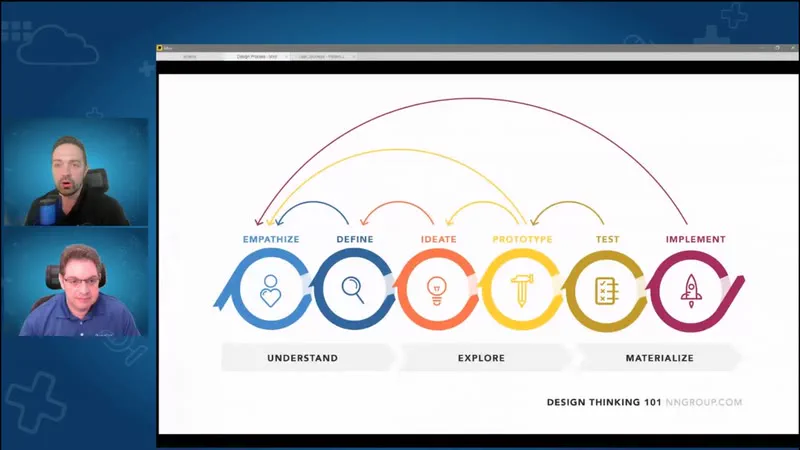
Yeah, definitely. There are certainly a lot of benefits to investing in UX and UI, and we have adopted the design thinking approach, which is an iterative design process. We go through it on each of our projects, where we try to understand our users and their needs, explore different ideas, create wireframes and user flow diagrams, and then design the high-fidelity mockups, to test our solutions by leveraging iterative prototypes before our developers begin implementing them.
I wanted to show you an idea of how the process itself works. It’s a cyclical process, but it doesn’t have to repeat from one step to the next; it can really go from any step to any other step. So we go from talking to the users and empathizing with them, to defining the problem, and then potentially back, or forward to creating our ideas or prototyping, and then back to any other step. And we repeat the process as necessary until we feel that the solution accomplishes the need, and then we begin actually developing it.
Interviewer: Is that common for you, to go back several steps? What are the triggers when you decide to go back to empathizing?
It really depends on the complexity of the product and the feedback we’re getting from both the stakeholders and the clients. Ideally we go through the process just once, but I think it’s basically impossible for any complex project to only go through it once. Where we try to do the least number of passes is the implementation, because it takes the longest: that’s where developers actually have to build the code. So if we make mistakes at the earlier steps, it costs us a lot of time and money to change the implementation. So we try to catch all the issues with the proposed solutions early. We can iterate very quickly on different prototypes and propose different wireframes, different high-fidelity mockups, and different prototypes. Then, as they start passing the tests, as in meeting the needs of the clients, we can begin implementing, hopefully just once.
Interviewer: I see. So you go through the design process, but how do you go about understanding each user type? We have many different types of users at AbbaDox, right? So how do you go about making the experience tailored to them?
Understanding the users is very important, and we prioritize that step of the process, to know who our target audience is and what their needs and expectations are. We actually began CareFlow by mapping out all the users that would be using our system, to the extent that we even named everybody. So we have Pat the Patient, Dr. Phil, who is the referring physician, and so on. And then we mapped out their interactions. This diagram actually keeps going and going and going, on how the different users interact with the different parts of the system. This helps us a lot to target the right audience and understand their needs and expectations.
This type of map is called personas. We want to ensure that our software caters to every persona, not just to what we think is useful. And when we test, we also test from the perspective of each user type. We began CareFlow, and we continue to start each feature, by first understanding who will be using it, and then mapping out all those user workflows by persona, and the jobs to be done by those people.
Interviewer: I see. And how often do you go back to the user journey like this? Every time there’s a new workflow in place, I’m guessing you have to figure out how they’re going to interact with it.
To a degree, for every project. Now, the further you get into the software itself, the more it becomes second nature. Once you intimately understand the different types of users, you don’t have to revisit this nearly as frequently. But it’s always a very good early step to map this out, and then to go back to those users to make sure they’re getting the tools they need.
Interviewer: I get it. So how do you make sure the system looks familiar for people who have never seen AbbaDox before, or never used it?
We designed and built a very comprehensive design system, and we borrowed ideas and components from other tech industry giants that our users are already familiar with, such as Microsoft, Google, and Atlassian, the builder of Jira. It is through this design system that we maintain a consistent look and feel across all the sections of our product, to ensure that the components are intuitive and familiar, for easy adoption. And since the initial design, we’ve also completed an accessibility color audit, to ensure that our color combinations pass the Web Content Accessibility Guidelines.
I do want to show some examples. We’ve created a fairly large list of different colors, and each color corresponds to a different section of our software or has a different meaning. Then we’ve created a variety of components in all of their states, such as buttons, button groups, switches, inputs, menus, and date pickers. And then we combine those components into more complex structures, such as our layout cards, and the headers and bodies of those cards. This helps our developers create a very consistent presentation, and it helps us lay out the data in a much more digestible manner for our users.
Interviewer: So is it fair to see AbbaDox as being on the forefront of UI and UX in the industry?
In the industry, I think that’s very true. Although, as far as the tech industry goes, we’re definitely trying to follow the bigger companies, you know, the Microsofts, the Googles, Atlassian, and other giants, because they’re really paving the way. And they’re making it easier for us to make things familiar to the user. Somebody who knows how to use Outlook will feel right at home with CareFlow, and if they know how to use Gmail, they’ll also feel right at home with CareFlow. You’ll see familiar-looking types of components. They’re not identical components, but there are certainly pieces of the puzzle that translate. When you see a toggle, it looks like a toggle. When you see an expandable element, you don’t wonder what it means or how to use it; you’ll know immediately that a card is going to expand and contract.
Interviewer: At the end of the day, AbbaDox aims to optimize workflows. That means, essentially, we aim for the least number of clicks. How do we accomplish this through UI and UX?
That goes back to understanding what our users need and what they’re trying to accomplish. One of the really important things is that every client is different. We could build a system like Outlook that treats the email-reading solution the same for everybody who uses it. Email is used exactly the same way by many different people. But in our case, radiology workflows are different from client to client. There are some similarities, of course: there are going to be patients, and there are going to be appointments, so certain things translate directly. But some things are very unique to different clients. They might have different rooms, different modalities, a different number of staff, and different stages of the registration process, the billing process, all of that. So while we maintain the overall design uniformity, we’ve created an extensive library of configuration tools that allow us to easily customize the system for each client, tailoring our solution to their existing processes while streamlining their workflows.
And I can actually show just the screen; give me one second, I’ll pull it up. In the very beginning, in some of our original designs, we were already thinking about how each user could save their workflows: it would save their filters and their work lists, so it would be easier for each type of user, or each particular person, to repeatedly do the tasks they were assigned. And the system would know: the order of columns would be tailored to that person, the order of filters would be tailored to that person, and they could save them. The system evolved, and there are still some features from then that we need to bring into the current version. But the look and feel went from these black-and-white original ideas, to adding some color while still figuring out the black-and-white portions, then refining it with more sections, like our patient summary widget, which eventually evolved into this. This would be the latest design, with a much more refined patient summary widget, better filter organization, better colors that now pass accessibility standards, and a much more streamlined presentation of data.
Interviewer: Let me circle back on what you were mentioning in terms of accessibility features. You mentioned the color audit. What does it mean, exactly?
To give you a simple example: we want to ensure that people who have some difficulty seeing colors can still read and see all the content on the page. That means making sure things like this gray background are light enough that the text on top of it is easy to read. It means that when an icon symbolizes something, it’s reinforced by something else that also explains what it is. Here we have a little bit of color: every status code is color-coded, but just showing the color of the status is not sufficient. You have to say that this color means it’s the Scheduled status. So if a person using the system is even partially color-blind, and doesn’t know what color that is, or there are a lot of colors that are similar, the colors are further reinforced by the label next to them.
Same thing here. We could have just had a little exclamation point in red, which is still better than just having a red color. You could make this text red, saying the appointment is a STAT appointment, but just having red text really wouldn’t be enough. Having an icon helps, and having text that explains what that icon means, in addition to the color, is the ultimate goal, where you have multiple factors reinforcing the usability.
Interviewer: Is it safe to assume that it also helps regular users go through the UI, because there’s higher contrast and they can pick up information faster as well?
It certainly doesn’t hurt. People who have perfect vision can see more color nuances, which in some cases might be helpful, to have a wider palette. But just having a wider palette doesn’t mean you can remember what every color in that palette means.
Interviewer: All right, that’s perfect. Roman, thank you so much for going through how you go about doing designs, how it looks now, and what the process was to get there. We have this little tradition: once you’ve been on this little show, you enter the whole Hall of Fame of AbbaDox, and you get to be on our About page. As you may be familiar with, we have the tiles of every member of the team, and each has a personal hero, and they all look like their idol. So I created one for you. I hope you like it. Ready? I present to you Roman Federer, winning Wimbledon for the last time before retiring and getting into UI and UX. You look awesome; it looks like you won. So again, Roman, thank you so much for your time today. It was very instructive. We appreciate all the work you put into the UI, and I’m sure a lot of our users are very grateful to be able to enjoy the product, know how to use it, and understand it right away. So thank you so much.
Yeah, it’s been a really great experience. And honestly, being able to improve people’s lives by creating these intuitive user interfaces that truly transform their work and make it easier for them to do their jobs has been a very fulfilling experience.
Interviewer: And we all appreciate your hard work making this happen. Thank you so much. All right, bye-bye.